Visually Crafted Graphics
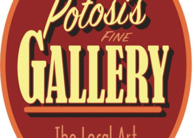
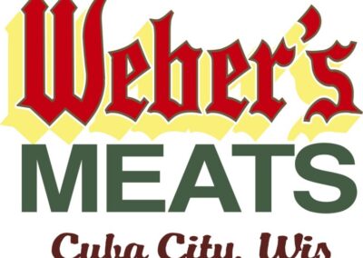
Bowden’s Brush Signs provides layout and design experience will communicate your message directly and effectively. Visually crafted graphics have focus and depth that draw the eye and maximize readability, at a distance and close up.
Good fundamental design assures possitve communication from your signage. That is the place were the value of your sign is realized. The value of effective signage is maximized by a business when the copy is easily read at the greatest possible distance. The design is the important piece, that is the part that communicates the message.
The up front cost of the sign is minimal when amortized over the long life of a sign. Signs give advertising value that far exceeds the price per viewing of other advertising media; direct mail, newspaper, radio and television. If you don’t believe this check out what the US Government Small Business Administration has to say about the importance of effective signs. Click Here.
My lifelong interest in the visual arts has taught me to be self critical and analytical of designs and layouts that have caught my eye. There have been volumes written about what makes a design appealing. I’m only going to add two cents worth from the perspective of a small sign business owner who has worked with many other businesses to develop effective images to market their enterprise.
Logo Design By Bowden Signs
Are you starting a new business or re-branding an existing business? Do need to have a professional image to represent an orginazation? A logo designed by Tud will help to estiblish a brand and create an instant association with that logo and your business or organization.
Contact Tud today to discuss your needs and goals and how you can have him help create a logo or lettering design for you. Logo packages includes camera ready artwork logos, various digital files in various formats and exclusive copyright license to the design.
City of Platteville Logo Design Project
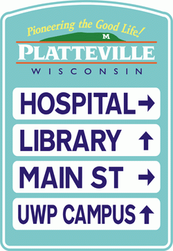
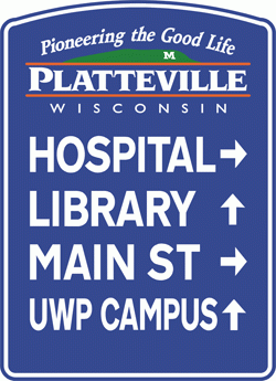
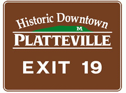
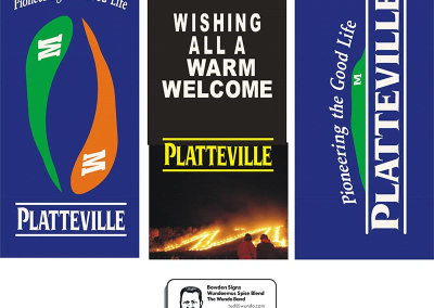
These are designs for a new logo and slogan for the City of Platteville. The slogan was developed in a workshop of public officials and citizens with the goal of developing a positive approach to promoting the City of Platteville. The logo was developed to use on way finding signs through the city, welcome signs and other promotional publications to present a unified image for Platteville.
The logo needs to communicate the city name and slogan with enough simplicity and focus that it will draw your eye from a distance and have the ability to be reduced and reproduced easily and clearly on business cards and even smaller formats.
Examples of logo used in directional signs:
Sign Design Elements Are:
content of message, the defined format, focus, contrast and last but not least color.
Content of Message:
This is the starting point. Say what you have to and leave it at that. It’s much easier to read and remember a couple of ideas or information than telling the whole story. The next trick is to prioritize the copy and or the image(s) so the most important element can occupy the focal point in the format. Then in following the secondary copy can fit around the primary message.
Defining the format:
This is the place where the choice is already made. The truck door, the van side, the window, the building all have specific height and width so the ideas needs to fit those parameters.
Focus:
This part of the design is mostly dictated by contrasting values within the design. The biggest factor is the balance of the the negative area (the space that doesn’t say anything) and the density of the message that it surrounds.
Contrast:
This is the least understood design element. The fundamental concept is the balance of light against dark & bold against thin (line values) which through these varying these elements, a sense of foreground, middle ground & background can be evolved to create a three dimensional look on a two dimensional surface. It’s an optical illusion but it truly makes the sign visually appealing and dimensionally believable. Maximizing viewer ship.
Color:
All good designs need to stand on their own in black and white before any colors are considered. Contrast is the most important design element for readability. Colors are used to create emotion and dimensional effects through their contrasting values. This creates texture in the design. Colors can also convey feeling, example: red for emotion, green for the environment and so on. Color can enhance designs but color can never make a design. Color seems to get the most concern from people in discussing a design but the more important fundamental design element is contrast.
